Lenka Míková architekti
A portfolio website for the Prague studio of Lenka Míková, working across renovations, interiors, residential and public buildings, and exhibition design — from the backstage spaces of the Czech Philharmonic at the Rudolfinum to exhibitions for the National Gallery Prague and the Aleš South Bohemian Gallery.
The brief
Get out of the photography's way. The studio's architecture rests on clarity, naturalness and the power of simplicity — the site had to embody those qualities rather than illustrate them. The interface is reduced to a floating logotype, three navigation items and white space with images suspended in it.
Homepage
It opens on a single photograph in a circular mask: an unexpected shape in an otherwise rectilinear world, working as both signature and invitation. No claim, no list of services — one project and a decision not to hurry.
Index and project pages
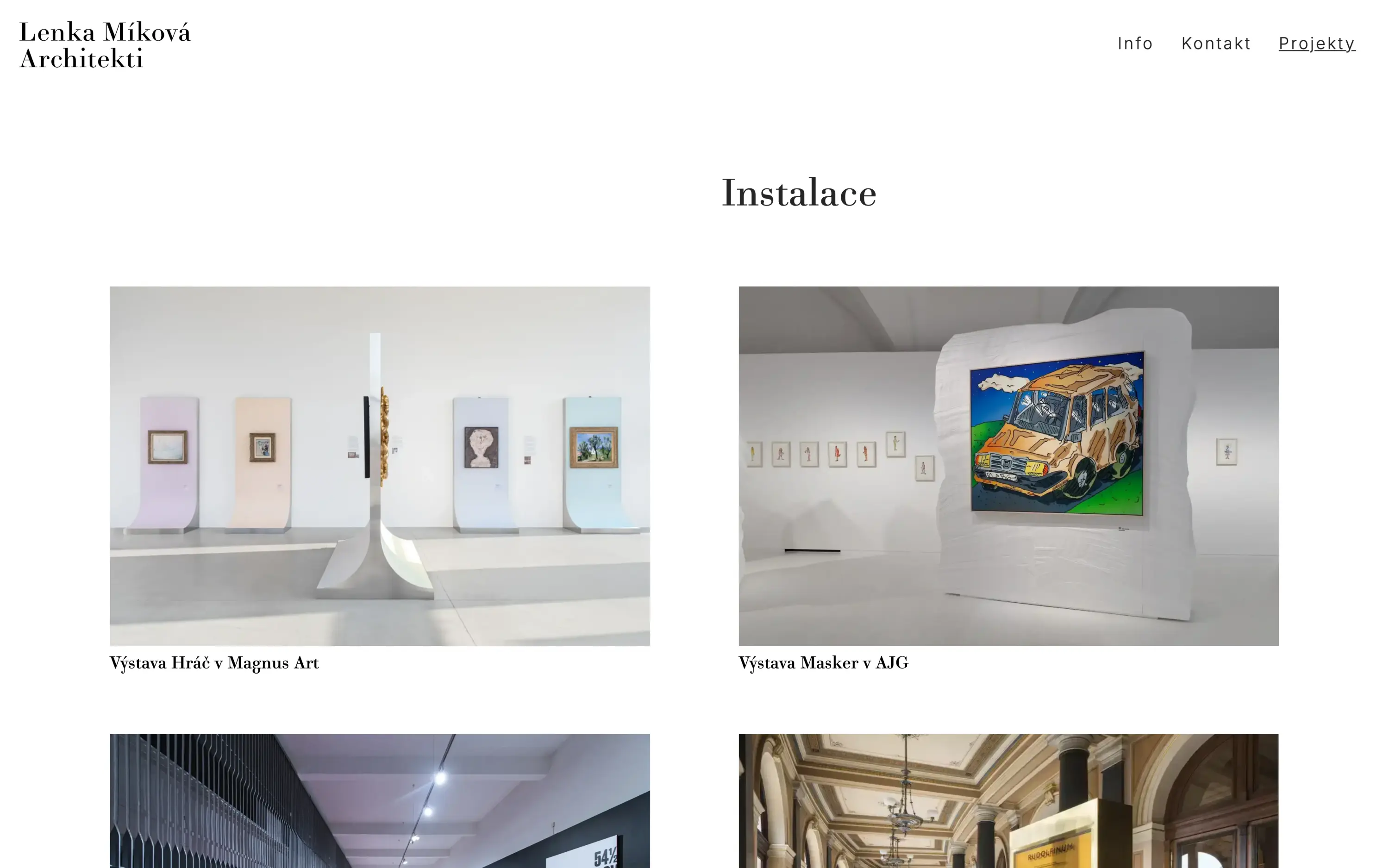
The index is a loose, offset grid; images alternate in a rhythm that never settles into a pattern, and the generous white space between them keeps browsing slow. Filters (residential / other / installations) sit inside the navigation rather than forming another layer. Project pages then separate narrative from fact: photography on the left, title, a one-line description and a table of location, year, floor area, team and photographer on the right. Readers choose whether to look or to verify.
Typography
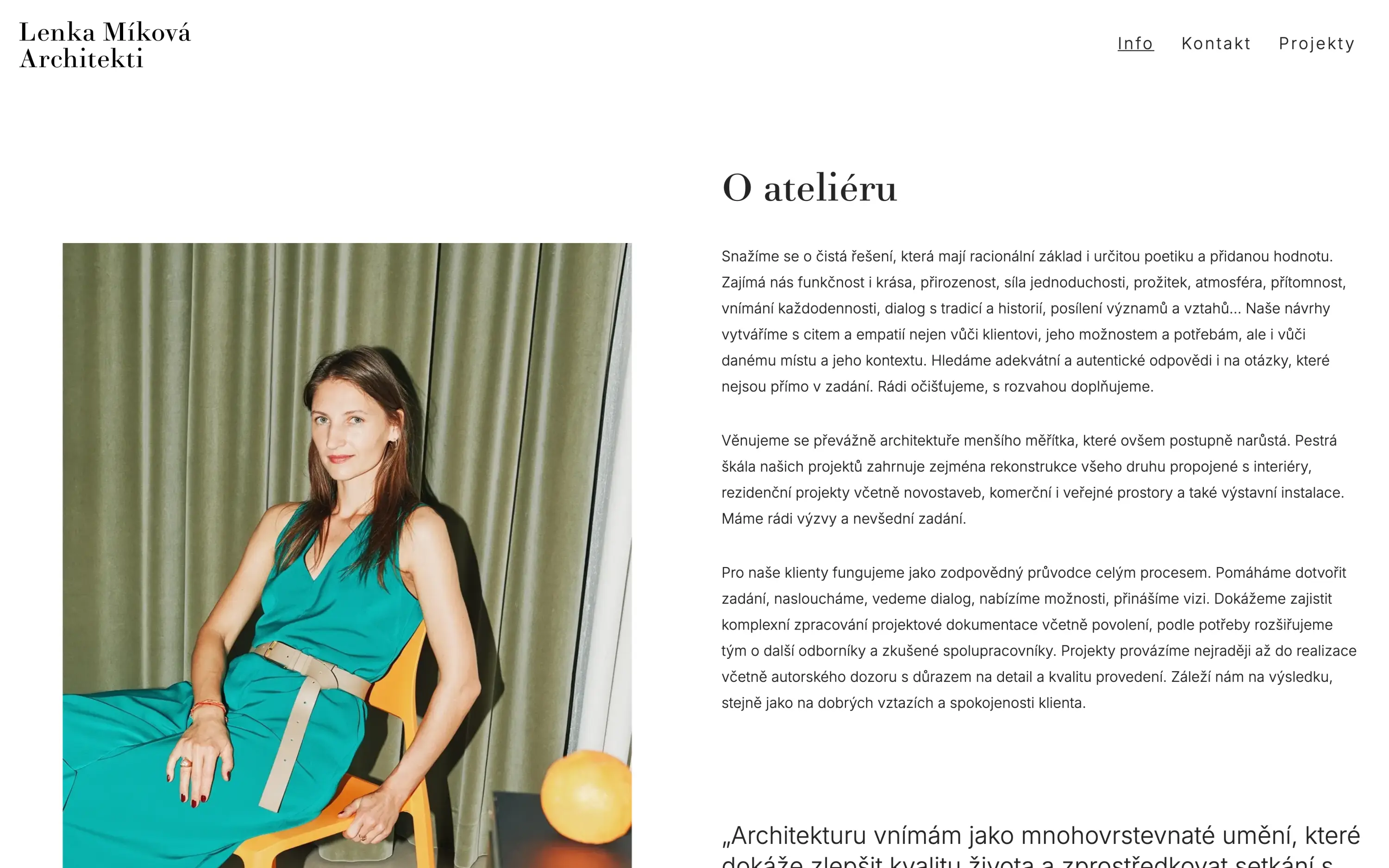
A two-typeface pairing carries the identity — Didot Elder Book for headings, Inter for body copy. The Didot holds a line of interwar elegance that many of the studio's renovations speak to; Inter stays quiet and lets it show.