Projects
Magdalena Turzová
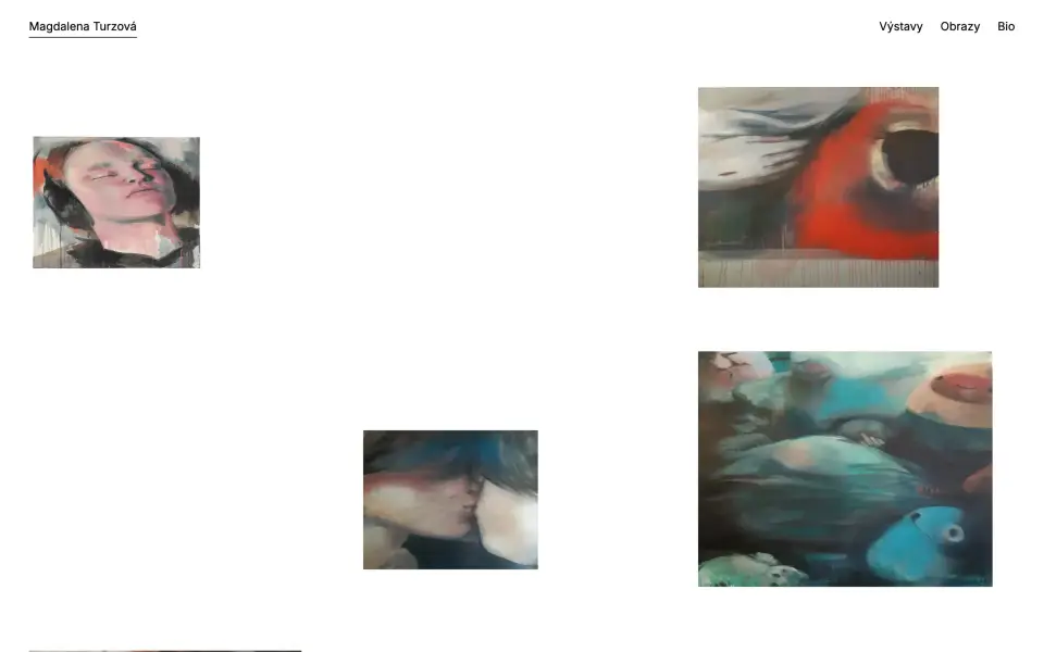
A website for the Olomouc-based painter Magdalena Turzová — figurative acrylic on canvas, with solo shows at Galerie XY, Galerie Caesar and the UFF festival in Uničov.
## The brief
Painters' websites share one trap: they try to be artworks themselves and end up competing with the paintings. The aim here was the opposite — a catalogue, not a design showcase. White space, no extra colour, no frames, a single typeface. Anything that would ask for attention is gone.
## The homepage as a hang
The opening page is not a grid of thumbnails but a scattered composition of canvases at different sizes on a white wall. It reads like an installation view: the paintings have air, they are not lined up in rows, and the eye picks its own route. Captions stay subdued so the first encounter is with the painting, not its title.
## Works and detail
The index of works is chronological, grouped by year. The year is the only heading and the only navigational aid, set in grey so that it structures without shouting. Canvases share one column width and keep their own aspect ratio, so formats differ in height and the page gains an irregular, living rhythm. A project page is then one painting, centred, with a single line beneath it: title, medium, dimensions, year — the wall label.
## Bio and exhibitions
The bio is a purely typographic CV: education, solo and group shows, each entry a single line opening with a year. Exhibitions get their own page with installation photographs, so it is visible how the paintings work in a room — something single reproductions never show.
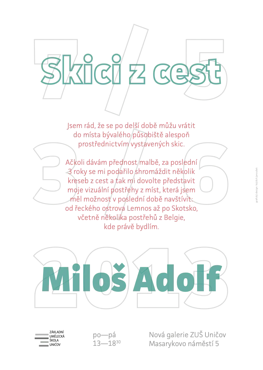
A long-running collaboration with the painter Magdalena Turzová — from exhibition graphics to her own website.
I enjoy building sites for people whose work is already strong: the whole discipline is in not adding anything. White space, one typeface, paintings hung across the page as on a gallery wall, and the year as the only heading. The hardest part was resisting the urge to make it "design" too.
Uničov All Around
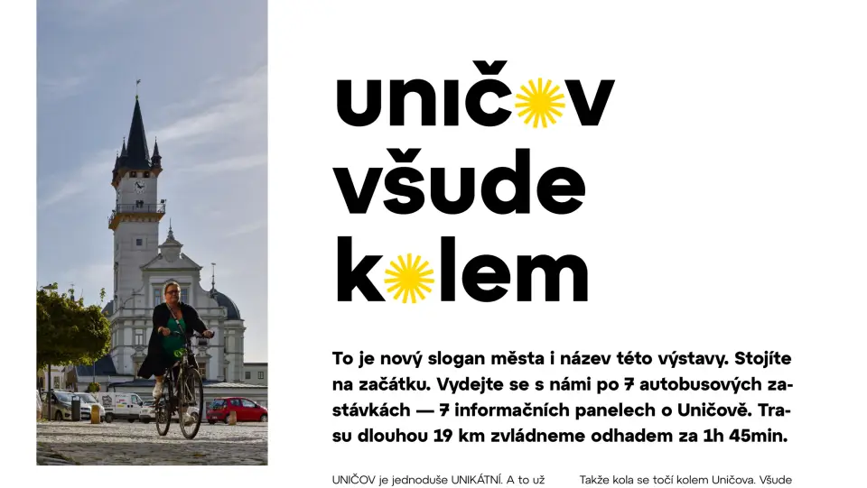
An exhibition about cycling in Uničov, scattered across seven bus stops. Seven A1 panels, a nineteen-kilometre route, roughly an hour and three quarters by bike — an exhibition you cannot walk through.
## The brief
Uničov had adopted a new slogan, "Uničov všude kolem" (Uničov All Around), and needed something to fill it with. Instead of panels in a gallery or on the main square, we dispersed the exhibition across the town and its surroundings: stops in Střelice, Benkov, by the railway station, by the Miele plant, in Brníčko and in Stromořadí. The form says what the content says — by bike you can get anywhere.
## The visual principle
The town's logotype carries a sun symbol in place of the letter O. In the exhibition title it reads equally as a wheel, and because it occurs in both "Uničov" and "kolem", it holds the whole wordmark together without a single added element. The yellow from the town's identity stayed the only accent colour; everything else is black on white.
## A panel as a spread
Each stop has its own topic — Bikes for Africa, trail and road, history, cycle paths, racers, culture. Each panel is therefore built like a magazine spread: a strong headline, a standfirst, columns of text and bands of photographs. Yellow boxes with QR codes point to what would not fit — the local trail network, a chronicle of cycling in the town, a documentary film.
## Finding your way
The footer of every panel lists all seven stops with the current one highlighted in yellow. Anywhere along the route you know how much is behind you and what lies ahead — the exhibition works even for someone who runs into it halfway.
An exhibition about cycling spread across seven bus stops around Uničov — nineteen kilometres, about an hour and three quarters by bike.
What I like most about this brief is that the exhibition cannot be cheated. You cannot walk it in ten minutes and leave; you have to get on a bike and ride a stretch of the region I live in. The sun symbol from the town's coat of arms reads as a wheel in the title — that was the moment it became clear the whole theme holds together by itself.
Beránek — Visual Identity
Complete visual identity and communication for Beránek — lunch delivery and catering. The design included logo, posters, social media, and wayfinding.
Beránek is a project we built from scratch with a group of friends. From the first idea to posters on walls — this is a project I poured my heart and soul into.
Beránek — Web & App
Digisemestr
Campaign graphics for the recurring educational programme Digisemestr focused on digital skills. The design included social media visuals, banners, and printed promotional materials.
Dobrodění
Dobrodění is a cultural and charitable project that connects art with helping those in need. Organizing something that goes beyond design is incredibly enriching for me.
Futured
UI design of web applications for the technology company Futured. The work included designing user interfaces, component libraries, and interactive prototypes for client projects.
Na vlně DBZ — Podcast Logo
Logo for the Na vlně DBZ podcast.
Logo for the Na vlně DBZ podcast.
Nautika
Visual identity and graphic design for the Nautika festival, a cultural event connecting various art genres in a unique setting. Deliverables included complete visual style, print materials, and digital communication.
Nautika is our second festival venture, and this time we went even bolder. I designed the entire visual with the goal of capturing the atmosphere we wanted to create together.
Primeros — Rebranding
Visual identity redesign for Primeros, a provider of first aid and medical services. Deliverables included a new logo, brand manual, templates, and applications across print and digital materials.
Primeros — Facebook
Design of a new website for Primeros, building on the visual identity redesign. The website was designed with a focus on clear service presentation, easy navigation, and a modern user experience.
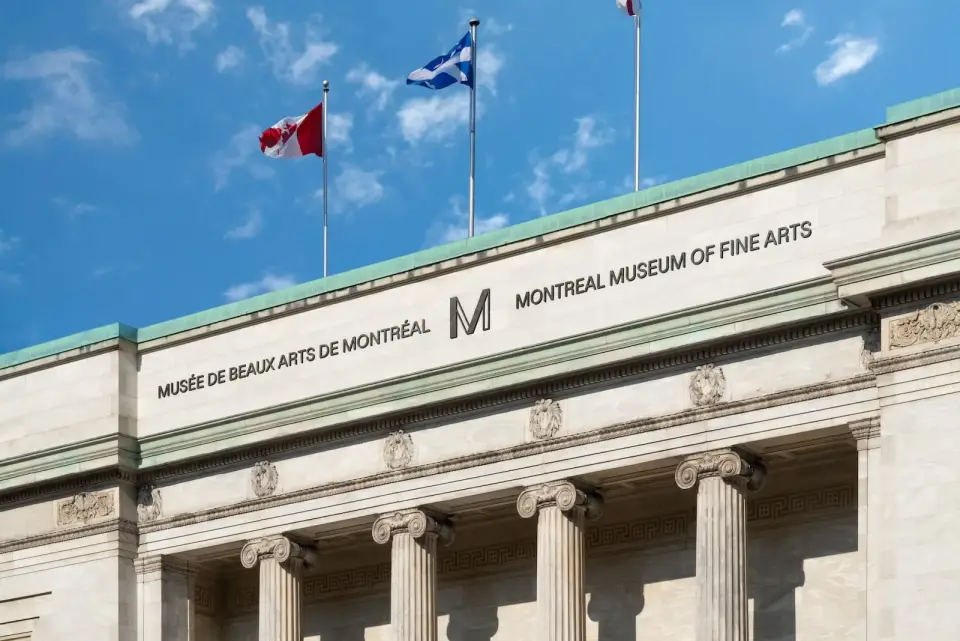
Reshoper
Campaign materials for the e-commerce conference Reshoper. Deliverables included visuals for online and offline promotion, social media, and attendee materials.
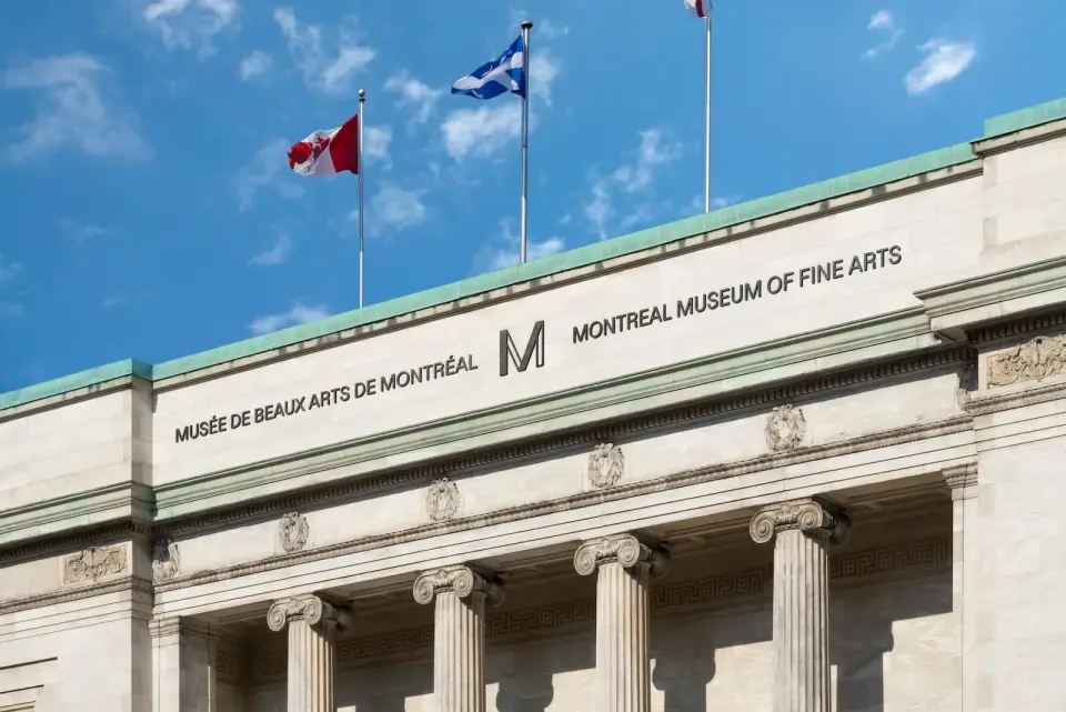
ALLGARD
Visual identity and web design for ALLGARD. The project included logo design, corporate materials, and responsive website presenting the company's services.
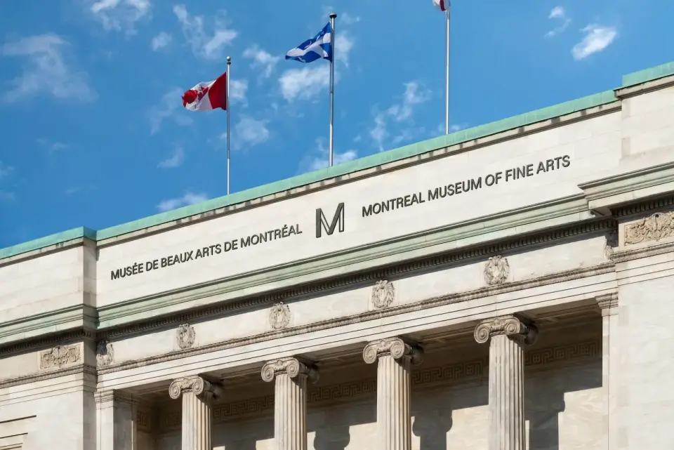
Kronikář
Kronikář is a project where I combined my interest in local history with design. The result is a series of materials that document and make stories from the past accessible.
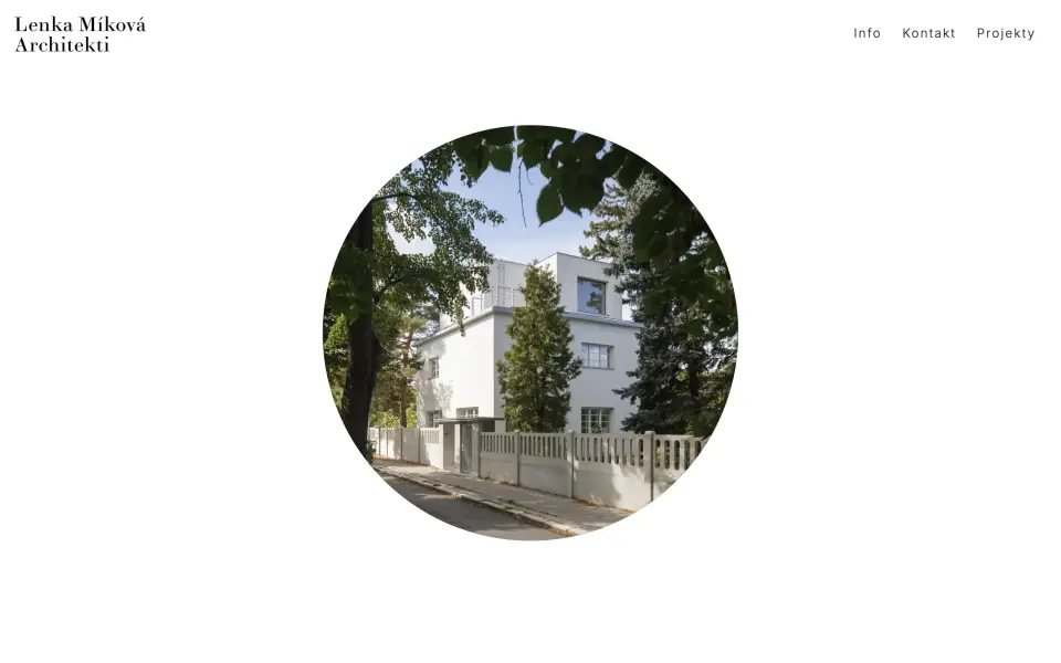
Lenka Míková architekti
A portfolio website for the Prague studio of Lenka Míková, working across renovations, interiors, residential and public buildings, and exhibition design — from the backstage spaces of the Czech Philharmonic at the Rudolfinum to exhibitions for the National Gallery Prague and the Aleš South Bohemian Gallery.
## The brief
Get out of the photography's way. The studio's architecture rests on clarity, naturalness and the power of simplicity — the site had to embody those qualities rather than illustrate them. The interface is reduced to a floating logotype, three navigation items and white space with images suspended in it.
## Homepage
It opens on a single photograph in a circular mask: an unexpected shape in an otherwise rectilinear world, working as both signature and invitation. No claim, no list of services — one project and a decision not to hurry.
## Index and project pages
The index is a loose, offset grid; images alternate in a rhythm that never settles into a pattern, and the generous white space between them keeps browsing slow. Filters (residential / other / installations) sit inside the navigation rather than forming another layer. Project pages then separate narrative from fact: photography on the left, title, a one-line description and a table of location, year, floor area, team and photographer on the right. Readers choose whether to look or to verify.
## Typography
A two-typeface pairing carries the identity — Didot Elder Book for headings, Inter for body copy. The Didot holds a line of interwar elegance that many of the studio's renovations speak to; Inter stays quiet and lets it show.
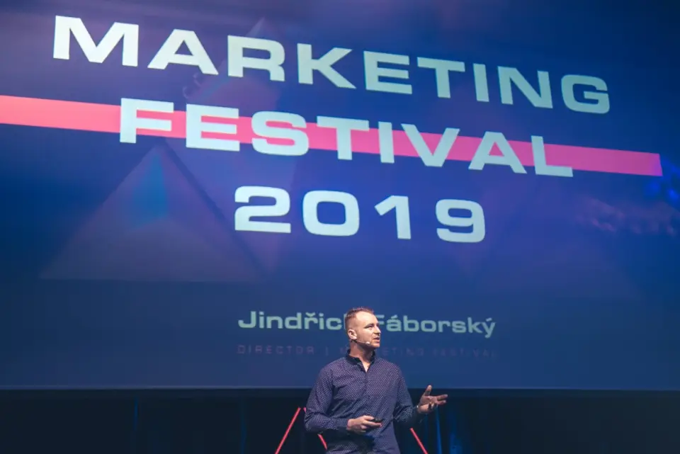
Marketing Festival
Campaign graphic design and visual identity for Marketing Festival, one of the largest marketing conferences in the Czech Republic. Deliverables included campaign visuals, social media, and print materials.
Marketing Festival is a huge event, and working on its visual was a great experience. The challenge was to create a design that appeals to thousands of marketers while standing out in the content flood.
Městská knihovna v Praze
Graphic design of brochures and web assets for the Prague Municipal Library. The project included informational materials, programme leaflets, and web pages for individual branches.
The Prague Municipal Library is an institution I admire — designing materials that bring people to reading was a pleasant challenge.
Mladá kamera
Graphic design and visual identity for the Mladá kamera film festival, a competitive showcase of student films. The project included posters, programme materials, and digital assets.
Mladá kamera is the sister festival of Mladý film, and working on it was just as intense. I love how both visuals complement each other while standing on their own.
Mladý film
Visual identity for the Mladý film festival focused on student and independent filmmaking. The design included logo, festival catalogue, posters, and online communication.
Mladý film is a festival where emerging filmmakers and cinema enthusiasts meet. It was great to design visuals that had to work just as well on screen as on a poster.
Aliance makléřů
Complete visual identity and web design for the Alliance of Brokers, a professional association of real estate agents. The project included logo, website, and presentation materials.
FFU / UFF
Organization of the FFU / UFF cultural project focused on connecting art students and presenting their work to the wider public.
FFU / UFF was a crazy idea that actually worked out. Connecting art students and getting their work out there — that was the main goal, and I think we nailed it.
Hnutí Brontosaurus
Visual communication and campaign materials for Hnutí Brontosaurus, the largest Czech environmental youth organization. The project included campaign graphics, social media, and print materials.
Working for Brontosaurus was a heartfelt project — helping an organization that cares for nature and nurtures young volunteers. Every poster had meaning beyond design.
Klub cystické fibrózy
Design of informational brochures and print materials for the Cystic Fibrosis Club, a nonprofit supporting patients and their families. The focus was on clarity and a sensitive approach to the topic.
Working for the Cystic Fibrosis Club taught me how important design is in health awareness. Every brochure could genuinely help someone.
Statky podstat
Statky podstat is a cultural project focused on reviving forgotten places and stories. I organized events and designed visual materials that helped draw attention to these places.
Academia film Olomouc
Visual identity and graphic design for the international popular science film festival Academia film Olomouc. The project included posters, catalogue, web assets, and festival wayfinding.
Academia film Olomouc is a festival that connects science and film — designing visuals for such a unique event in my favourite city was something exceptional.
Frank Bold
Graphic design of brochures and printed publications for the law firm Frank Bold. Materials included annual reports, informational brochures, and presentation documents.
Město Uničov
Design of a new visual identity for the city of Uničov, including logo, typographic system, and applications for official documents, wayfinding, and promotional materials.
Uničov is my hometown, so designing its new identity was something special. I wanted the logo and the whole visual to reflect the character of a place I know well.
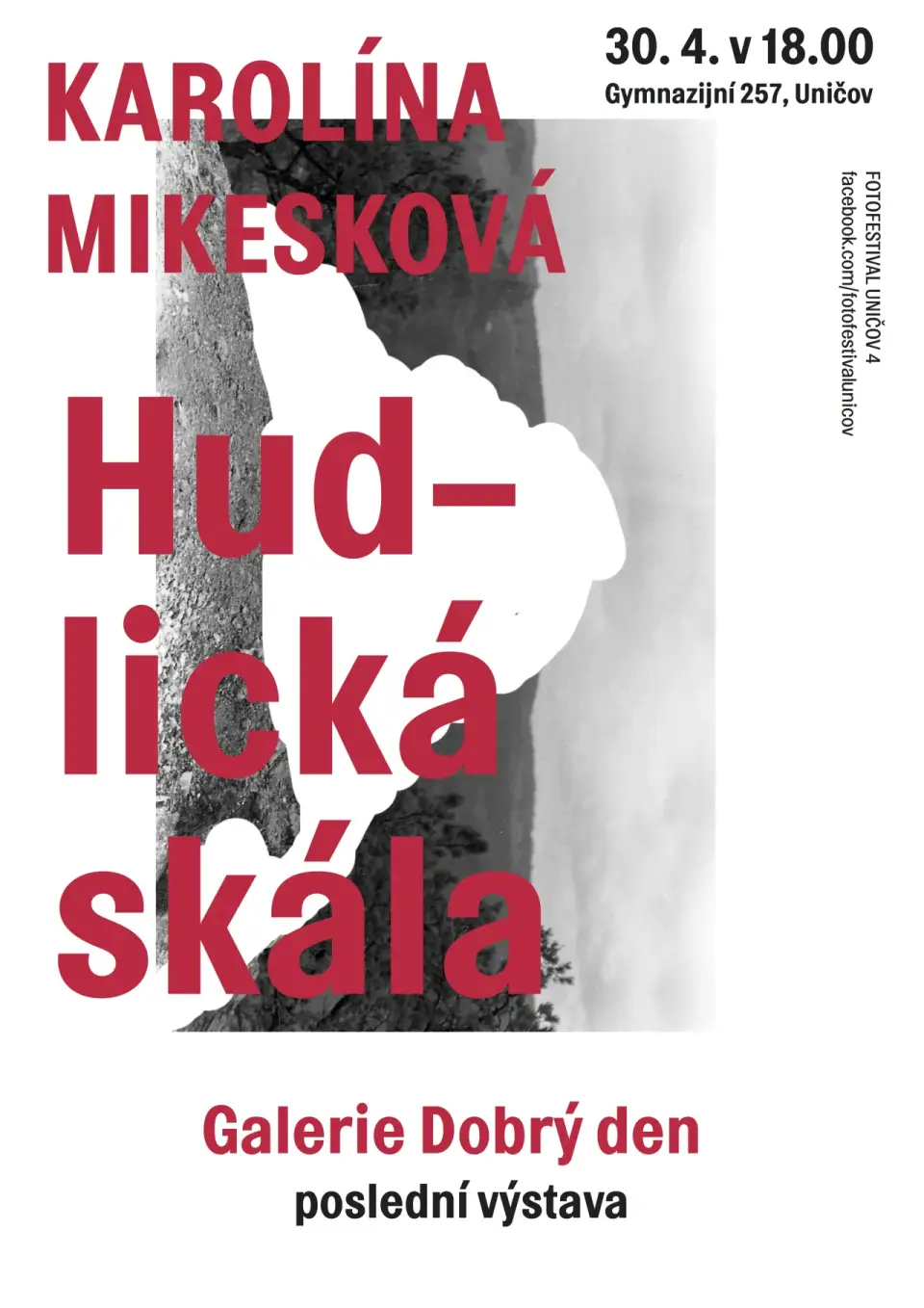
Karolína Mikesková: Hudlická skála
Sixth opening of Galerie Dobrý den. April 30, 2014.

Jakub Plachý: Wall Work
Jakub's drawing refreshes and performs as if lightly, though hard work and confrontation with classical study drawing hides behind it. The artist invited gymnasium students to send photos for wall portraits. 2014.
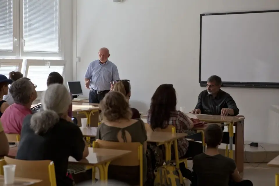
Barbora Kleinhamplová: Invisible Hand
Performance. Lecture at Gymnasium Uničov on market economics and debt, followed by a mass for debt forgiveness at the Church of Assumption in Uničov. Adam Smith's invisible hand concept and identity shaped by political-economic circumstances. 2013.
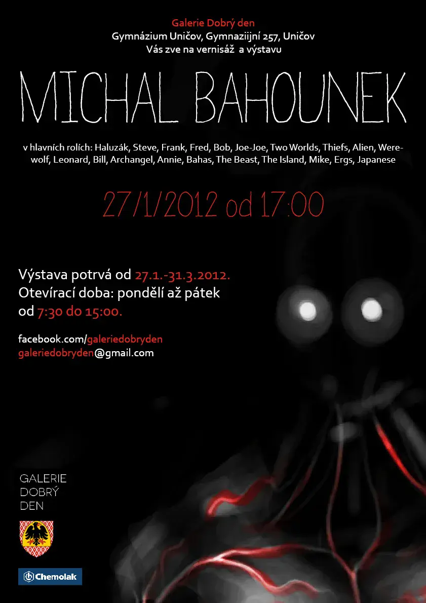
Michal Bahounek
Wall narratives with invented characters across the staircase. Inspired by comics, abandoned sites, war conflicts, film, and music. Wall paintings and object installations created over a week during school breaks. January 27 – March 31, 2012.
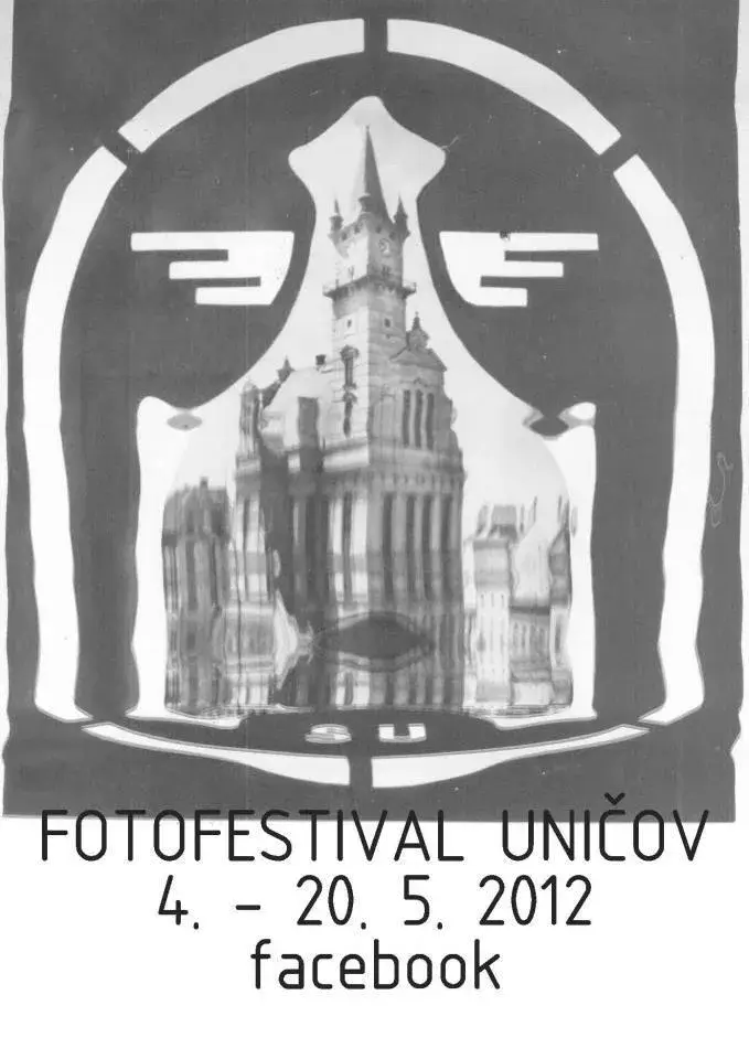
Ondřej Hruška: Terror Paris Uničov
Large-format prints in public space style using digital compact cameras. An attack on photography perception and analysis of visual information excess on the street. May 4 – June 30, 2012.
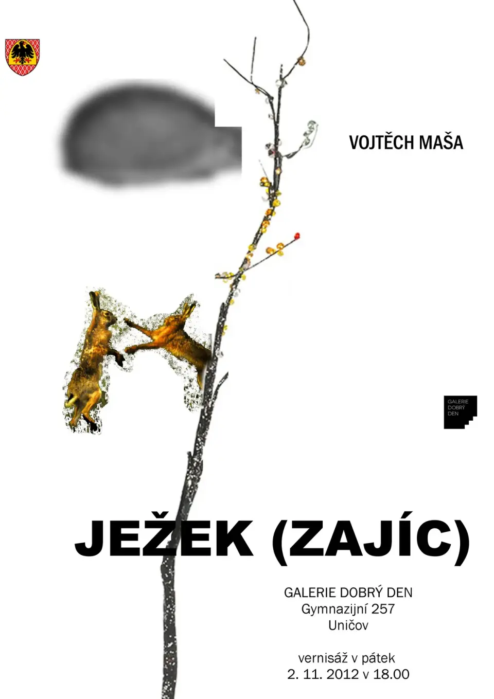
Vojtěch Maša: Hedgehog (Hare)
Symbolic display of feelings from remembering adolescence through animal imagery — confusion and unavoidable life choices. November 2 – December 21, 2012.
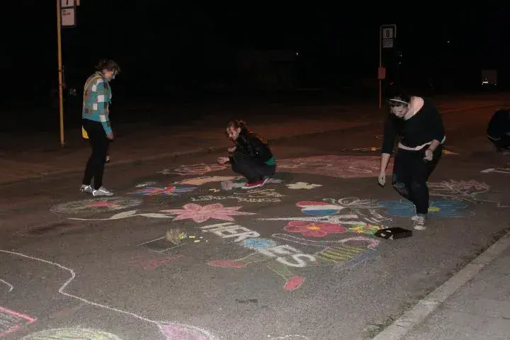
Galerie Dobrý den
Co-founding and curating the independent gallery Dobrý den, a space for contemporary art and community gatherings. The project included exhibition programme concept, visual communication, and opening events.
Galerie Dobrý den was born from the desire to have our own space for exhibiting and meeting. Every exhibition is a small adventure for me — from choosing artists to hanging the pieces.
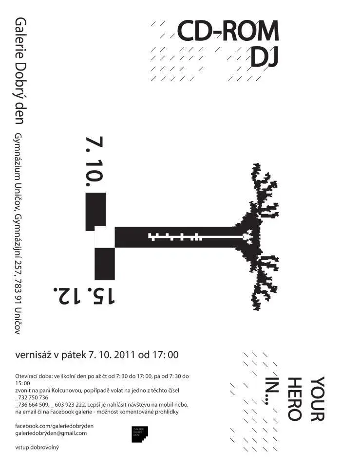
Tomáš Mlejnek: CD-ROM DJ
Inaugural exhibition of Galerie Dobrý den. Wall paintings and object installations combining painting, graffiti, and objects. Opening October 7, 2011, on view until December 15, 2011.
Archives